Most people will spend roughly 5 hours each day on their mobile phones, which is about a third of the time spent awake each day. These mobile users are typically very impatient and according to research will abandon a website if it hasn’t loaded in three seconds.
Knowing this, how can you boost your mobile traffic? There are certain key mistakes that you should avoid when it comes to improving your mobile SEO. Let’s explore.
1. Small Fonts
When you’re designing the look of your website, you should be focusing first and foremost on the mobile experience of the user. Bad mobile experience will have a negative impact on your SEO for mobile, specifically your bounce rate.
In WordPress always choose a SEO friendly theme such as Divi, which is optimized for mobile and other small screen devices.

You can find out this information in Google Analytics, and you will find that having a high bounce rate will affect how high you rank on Google.
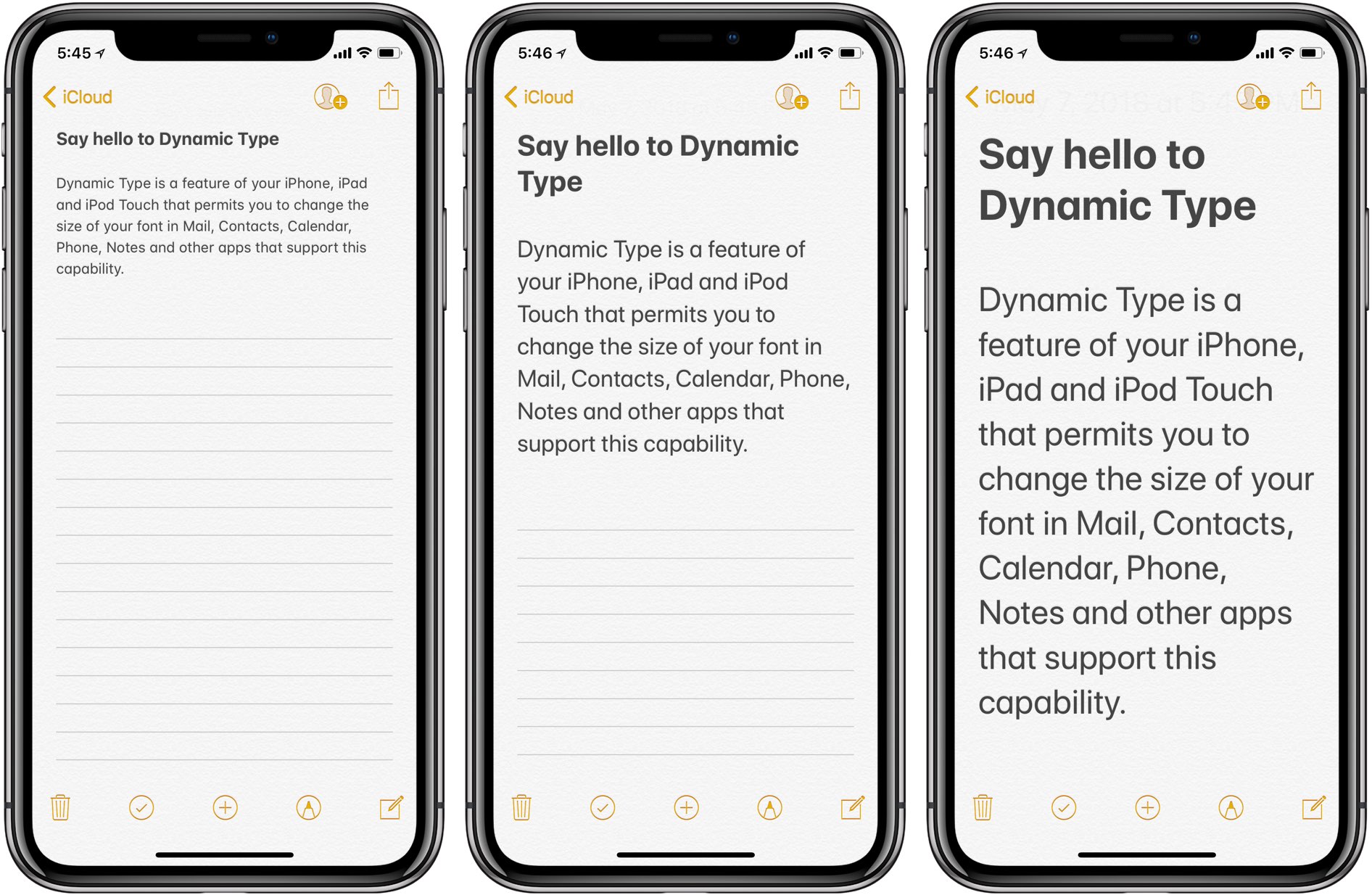
You should keep in mind that a font that looks great on your desktop or laptop would not necessarily look as good on a tablet or smartphone. That’s why you want to focus on your font and do some testing on mobile to see how it looks.
Avoid tiny fonts in the text body that will make it hard to read your content. The same goes for your header. If it’s a big header on the desktop version, it might be taking up the whole mobile page.
2. Slow Page Loads
As many as half of mobile users will leave your site if it doesn’t load quickly enough. That’s not really a surprise considering how many other options they have out there. It’s easier for them to leave your site and go to a competitor that has greater functionality.
Always choose a super fast WordPress hosting provider such as WP Engine or SiteGround. Also install Caching plugins and never upload images without compressing them. TinyPNG.com is a free website, where you can upload upto 20 images to reduce the size of images without losing qualaity.
To address your site speed, you can compress your images using a free online tool. You can also optimize your code and make sure your website host is upgraded.
3. Not Optimizing by Keyword
Businesses make the mistake of thinking that the keywords on the desktop are also optimized for mobile. In reality, it can often be quite far from the truth. That’s because, on mobile, people tend to search differently than they do on a desktop.
There are many free SEO plugins available for WordPress. Install any SEO plugin and optimize each blog post before publishing it. Jetpack also has a SEO optimization feature.
For example, mobile users will send in shorter search terms because they want the answer quickly. Voice searching is also a possibility. To optimize by keyword, you’ll want to focus on phrases and questions that are more conversational in nature.
4. 404 Errors
These types of errors are very frustrating, and even more common on mobile. It happens when someone will put in a URL incorrectly or if the page doesn’t exist. Often, business webmasters make the error of failing to create the mobile version of a page.
You can use a free service like brokenlinkcheck.com to find all broken links on your site.
If that’s the case, you’ll want to at least redirect users to the desktop version. The more links on your page that are broken, the more your ranking will be affected.
5. Not Having Blank Spaces
Mobile users don’t want to be swamped by content across their screens. You should be maximizing blank space by using short paragraphs of one to two sentences each. It makes your content more readable and best for skimming. This is perhaps the aspect to pay the most attention to.
6. Not Using Interstitials Properly
Many users will leave a website completely if they get annoyed by pop-ups that take up the whole screen. Google will also punish your site if the interstitials are too intrusive. You don’t need to avoid them completely but you should make sure that on a mobile device they only take up a small piece of the screen.
7. Not Optimizing Locally
You should be focusing on local keyword optimization because users will use local terms more frequently on their mobile than on their desktop computers.
These are quite transactional, so you can get more value out of it for your business. That’s why it’s key to put effort into using local keywords.
In today’s society, with a focus on smartphones and mobile searches, you cannot afford to ignore mobile SEO. By being aware of these top seven mistakes, you can address them or avoid them and keep your website smoothly operating and mobile-friendly.